While the other big social platforms have introduced flashy new additions like searchable, in-stream GIFs and emoji response tools, LinkedIn – the elder statesman of the social world – has remained pretty professional. And also, a little bit boring.
That’s not necessarily a bad thing – each social platform needs to have its own points of differentiation, and Lord knows we don’t need more cat GIFs and random brain teasers (though, those are becoming more prominent on LinkedIn too). But every now and then, it’d be nice to get something out of LinkedIn, just a bit of a re-fresh, a change of scenery to liven it up a little.
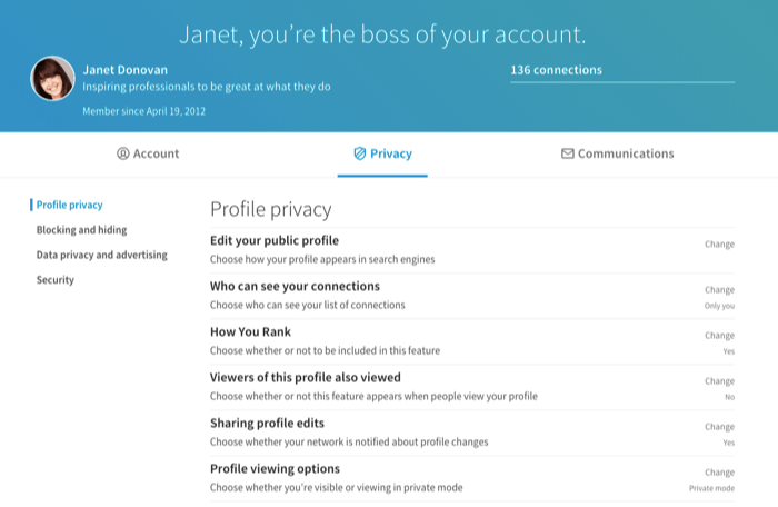
Lucky for me, LinkedIn appears to agree – today, via the official LinkedIn blog, the professional social network has unveiled their new look Privacy and Settings dashboard, with a whole new layout, structure and improved options to help users better navigate and understand the options available to them.
.png) On first glance, the new option is totally unrecognizable from what it once was – for comparison, here’s the current Privacy and Settings screen on desktop.
On first glance, the new option is totally unrecognizable from what it once was – for comparison, here’s the current Privacy and Settings screen on desktop.
 Pretty big change, huh? I don’t know about the ‘you’re the boss of your account header’, but the rest looks pretty good. The style is more in line with the recent upgrade to the LinkedIn mobile app, which was re-built from the ground up.
.png) The new layout is focused on simplicity and clarity about how your LinkedIn profile is managed – which somewhat goes along with the ‘you’re the boss’ focus. And an important note that LinkedIn underlines in their announcement:
The new layout is focused on simplicity and clarity about how your LinkedIn profile is managed – which somewhat goes along with the ‘you’re the boss’ focus. And an important note that LinkedIn underlines in their announcement:
“No settings have been taken away and no default or preferences have been changed – we’ve made sure all settings are in place and are easier to control.”
The new Privacy and Settings page is categorized into three groups: Account, Privacy and Communications.
· Account includes things like adding email addresses, changing your password or language, and exporting your data.
· Privacy covers all privacy and security settings related to what can be seen about you, what information can be used, and making sure your account stays secure with a second factor of authentication.
· Communications houses your preferences for how LinkedIn and other members are able to contact you, and how frequently you’d like to hear from us.
So, no new additions in functionality, just a more clarified way of communicating them and how each one relates to your on-platform experience.
LinkedIn’s also updated the controls users have over how others find them based on their phone number and e-mail address. When users upload their contacts list, they’re given a list of suggestions based on those details. Now, members will have more control over whether they show up, and who they show up to, via this process.
 While the upgrade adds nothing major in terms of functionality, it is good to get a new look on LinkedIn, a new way to explore and utilize the platform’s processes – and a step in the right direction, in my opinion, to help users make the most of LinkedIn’s features.
The changes will be rolled out to all users over the next few weeks – so if you’re not seeing it yet, hold tight.
[SOURCE :-socialmediatoday]
