/cdn0.vox-cdn.com/uploads/chorus_image/image/54862145/Things_Hero_2___macOS.0.png)
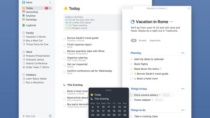
Few apps have made a more valiant effort to rescue us from indolence than Things, the to-do list app for Mac and iOS from German software developer Cultured Code. When it debuted as one of the original iPhone apps in 2008, Things was notable for its strong compatibility with Getting Things Done, the popular productivity system. Its original incarnation won an Apple Design Award, and by 2014 Things had sold 3 million copies of its iPhone app alone.
But in the intervening years, Things has come to look a little dated. Visually, it hadn’t quite shed the skeuomorphism of older versions of iOS. And while other to-do apps were focused on collaboration — encouraging small teams to subscribe to premium versions that let them delegate tasks to one another — Things remained a resolutely single-player game.
In 2014, when I evaluated the best to-do list apps on the market, I held off on including Things after the team told me they were hard at work on the next version of their app: Things 3. They had been working on it for two years — and would continue working on it for the next three.
And so when Things 3 finally arrived this week, for a certain kind of productivity nerd, it felt like a major event. I’ve been using the app on Mac and iOS for the past week, and have generally been impressed — despite a handful of flaws that will likely be deal-breakers for many. But mostly I want to talk about three things Things 3 does extremely well — and ought to inspire makers of to-do list apps the world over to imitate or improve on them.
/cdn0.vox-cdn.com/uploads/chorus_asset/file/8546979/IMG_0464.PNG)
The upcoming view. One of the chief design decisions the maker of a to-do list app has to make is how to display your upcoming tasks. OmniFocus, perhaps the most overpowered of all to-do lists, offers a “Forecast” view that shows you the number of tasks you have coming up over the next week. Todoist, which has been my to-do app of choice for the past two years, offers both “today” and “next 7 days” views that list your upcoming tasks in order.
Things 3 builds on this idea, ingeniously, by integrating your calendar. Connect to your Google account or other calendar service and you’ll see your appointments for the day, followed by any tasks that are due. “Today” shows you a single day; “Upcoming” offers you an infinite scroll into the future with whatever you have planned. A combined calendar, to-do list, and reminders app is something of a holy grail in the productivity world; Things 3 gets extremely close to realizing it.
/cdn0.vox-cdn.com/uploads/chorus_asset/file/8546995/IMG_0465.PNG)
Project completion circles. How close is your project to being complete? Other to-do list apps require you to look inside a project and estimate for yourself how much work it will take to perform the next steps. Things 3 answers this with a lovely visual metaphor: circles next to every project that fill in as you complete tasks. If a project has five parts and you’ve completed four of them, you’ll see a tiny sliver left to be done. It’s gimmicky, but I appreciated being able to see how close I was to finishing a given project at a glance.
/cdn0.vox-cdn.com/uploads/chorus_asset/file/8547009/ImageJoiner_2017_05_19_at_10.09.17_AM.PNG)
The magic plus button. A good to-do list app makes it dead simple to create new tasks, and Things 3 has a fun tool to do just that. Cultured Code calls it the “magic plus button,” and it appears in a big blue circle at the bottom right-hand corner of the app. But it doesn’t just stay there: you can tap and drag it up and down, and side to side, and where it lands changes what it creates. Move it to the inbox and you can create a task without a due date there. Slide it up and you can create a new task within a larger project. Or drag it into your project list to create a new project immediately.
There’s other great stuff here, too. You can set a task to “evening” — a useful designation for all the stuff you’re saving for after work. “Anytime” and “Someday” lists encourage you to daydream. And the individual tasks cards are designed with beautiful minimalism.
So what are the potential deal-breakers? One, Things requires you to live entirely within the Mac ecosystem — if you’re away from your devices, you can’t even access your work from the web. Two, Things is still for individuals — there’s no easy way to collaborate with colleagues on your projects. Three, there’s no natural-language input in the task entry window. On many to-do apps, including Todoist, you can type in something like “finish assignment by 2P Wednesday” and the app will attach the appropriate due date. On Things, you can only access natural-language input after clicking the date picker. Then there’s Things’ business model, which also feels a bit dated: instead of paying a single subscription fee to access all of the companies’ apps, you have to buy the iPhone, iPad, Mac, apps separately. (They are $10, $20, and $50 respectively.)
Despite those faults, I’ve switched over to Things to manage my tasks, at least for now. And who can blame me? No piece of software is more tempting than a brand-new to-do-list. Installed on your phone, it becomes a wonderland of possibility — a blank canvas on which you can project your wildest dreams, and through the power of software achieve them. Never mind that your determination will falter. That the tasks you entered so lovingly will refuse to do themselves, and will instead glare at you from your to-do app, making a mockery of your dreams. Never mind that you will delete it, and resolve to better yourself
[Source”timesofindia”]
