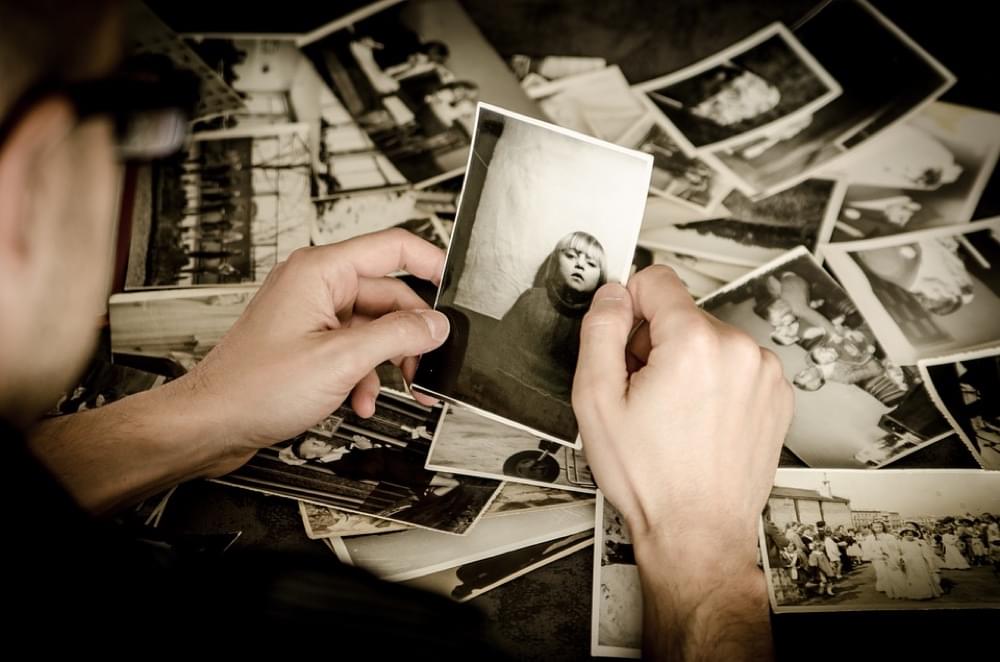
Right now, more than ever before, we’re seeing all sorts of nostalgic throwbacks causing us to reminisce about the good ol’ days! We’re seeing an endless supply of remakes, reboots and long-awaited sequels like Spider-Man and Ghostbusters; Bruno Mars topping the music charts with songs that sound eerily similar to classic hits by Kool & the Gang; women wearing chokers and high-waisted pants.
And this isn’t a new phenomenon either.
Every generation daydreams about how things were way back when, and what’s changed since.
It’s true, nostalgia is a very powerful emotion. It can even make us feel happy and at the same time, and in design/marketing, we can use nostalgia to captivate users…then convert them.
Contents
What the Research Says About Nostalgia
Nostalgia stirs up very strong feelings, so there’s something to be said about user psychology and why we continue to see retro throwbacks time and time again. After all, the goal in marketing is to create content that taps into our audience’s emotional core and establishes a much deeper connection with them far beyond a superficial “Buy 1, Get 1 Free” offer.
Nostalgia achieves that well.
So…jumping on the retro bandwagon: is it really worth it when “comebacks” tend to have such a short-term expiration?
Yes.
Studies suggest that not only are nostalgic marketing angles captivating to audiences, simply for the reminiscent feelings accosted with them, but retro visual aesthetics can boost these effects even further, and that’s where design comes into it. Let’s take a closer look at what exactly happens when we feel nostalgic.
Nostalgia in web design makes visitors feel more connected
Dr. Filippo Cordaro, a researcher of nostalgia from the University of Cologne, found similarities between an individual reminiscing about the past and the level of social connectivity they felt. He explains:
“On a basic level, recalling these positive memories simply puts us in a more positive mood. On a more complex level, recalling these experiences makes us feel a stronger sense of social connectedness with others.”

It’s the latter half of this conclusion that’s most important for marketers and web designers to understand; that feeling of “connectedness” is what we should be striving for, and we can do this by telling stories through visual design and using imagery that visitors can relate to. While a superficial offer/discount might grab the user’s attention momentarily, digging deeper into the audience’s emotional core and establishing a more genuine, heartfelt connection is more effective overall.
In short: nostalgic hooks are more memorable because they’re based on experiences familiar to the visitor.
Real Examples (and what we can learn from them)
If you’re curious to see how you might use nostalgic hooks in visual design and communication, then check out what these brands have done and the effects they’ve had.
Danner
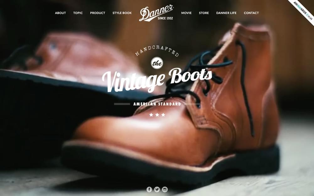
Overall, the vintage-style typography and classic insignia-style details compliment the (more modernized) minimal/flat approach to the layout, where the two styles come together to convey the vintage brand that is Danner’s boots. Danner’s was founded in 1932, so you could say that the visual aesthetic is a modern twist on a vintage brand that customers already know and love. You have to stay true to your roots (as they say), but you also have stay with the times. Danner’s Boots does both.
Also, as you may have noticed, brown/beige colors are quite common in vintage visual aesthetics. Color can also play a huge role in influencing how users feel.
Desires Tram
Desires Tram is another web design example where mixing somewhat minimalistic layouts with vintage details has worked well. What we can take away from this is that serif fonts can still be bold, and bitmap images don’t have to impact loading times too much if used sparingly. Overall, these design elements, the “mascot” character and the magical sounds strike a wonderful blend of creativity and nostalgia like something straight out of Harry Potter.
Robby Leonardi
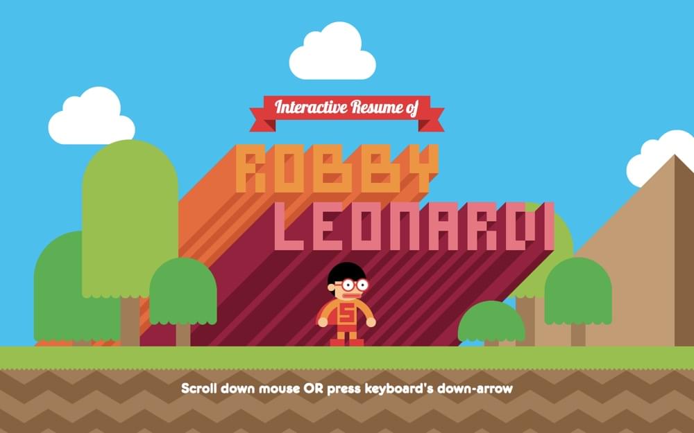
Retro video games. Now we’re getting to closer to the heart, because this is more likely to be “your era”. I wouldn’t be surprised if developer Robby Leonardi’s interactive resume resonates with you more than the first two examples, because retro video games are more likely take you back to your childhood (well…it depends how old you are I suppose!).
Brown/beige/grunge/vintage styles are certainly captivating and may induce feelings of nostalgia from a visual perspective, but it’s not something that’s likely resonate with you from an emotional angle (not unless you’re into vintage things, which you may very well be).
Even those that didn’t play old-school Nintendo games will undoubtedly recognize the “game” as a Super Mario-style game, so this is a type of nostalgia that won’t be lost on many users. It definitely takes me back and ultimately gets me to stick around his website a little longer.
St. Louis Browns Historical Society
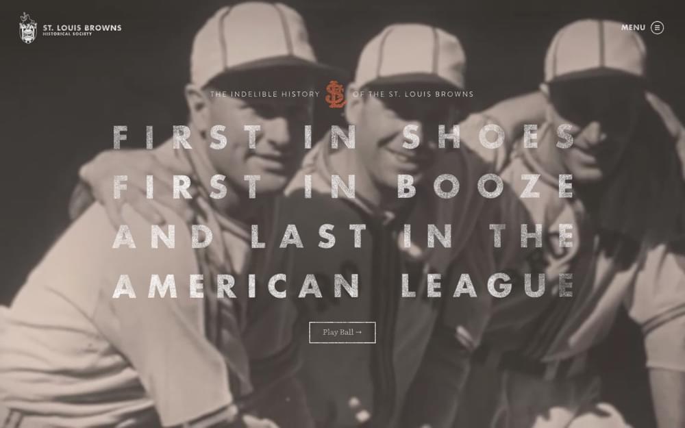
St. Louis Browns Historical Society is a terrific example of a website that makes use of real life footage. The home video approach intentionally touches the heart, and the rest of the website continues with some of the visual details we’ve seen in the other examples: grungey visuals and serif fonts combined with flat elements and sans-serif fonts, a perfectly executed combination of vintage and modern that lets retro designs work on the web today.
Yul Moreau
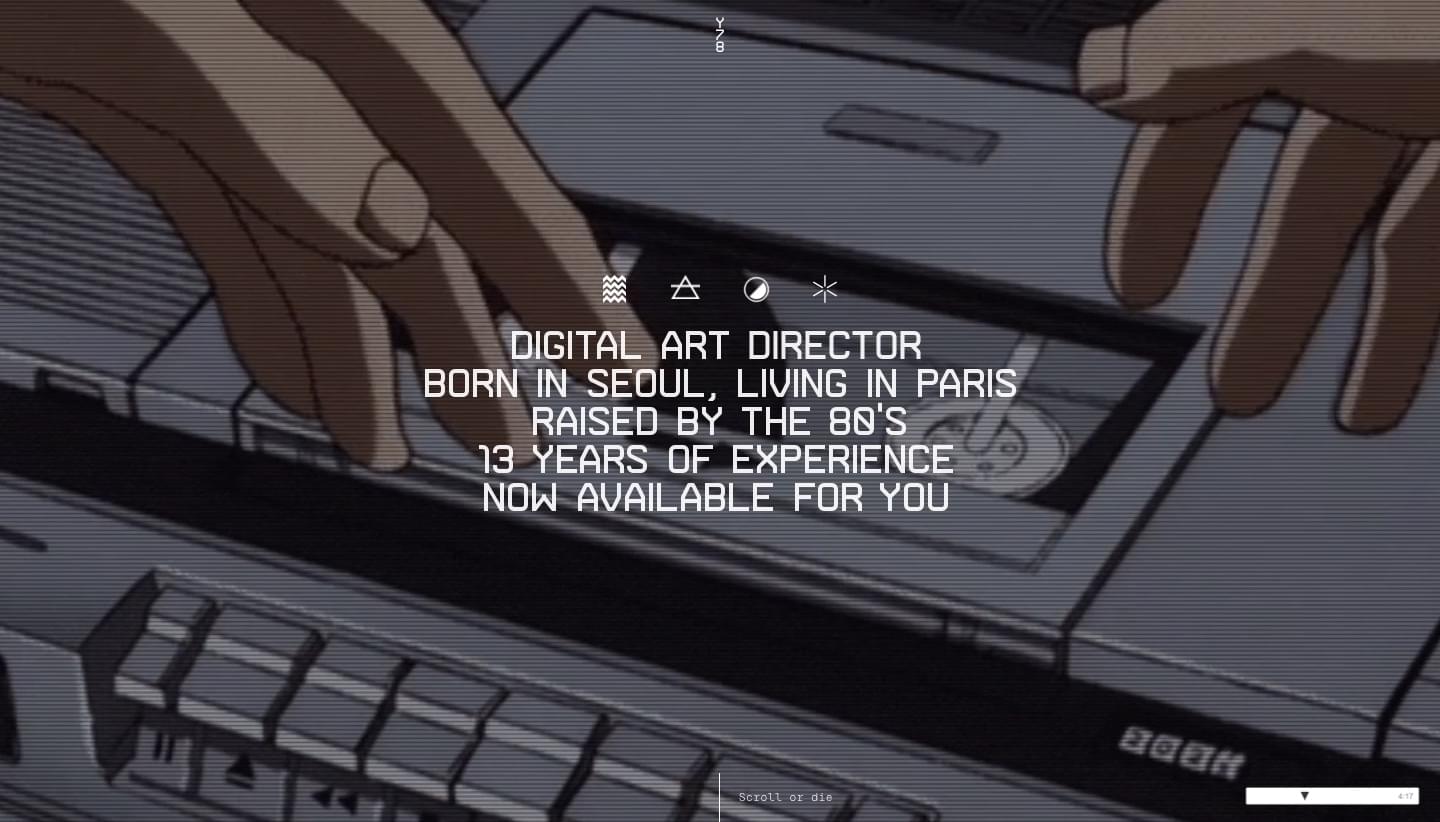
Yul Moreau’s website is another example that uses video, a technique that goes almost hand-in-hand with a nostalgic approach to marketing because of the interesting ways that they both captivate users emotionally. The fonts used are like something you’d find in the opening sequence of an ’80s sci-fi flick like Terminator or Blade Runner. The images and music almost seem like something out of Tron.
Yul Moreau specifically explains in the hero section that he was “raised by the ’80s”, so the retro approach that he’s taken works very well in telling his story as an ’80s born digital art director. I’d also argue that this “vision” of Moreau makes it easier to feel like you know him, so I would imagine that prospective clients would feel comfortable reaching out to him.
Don’t Force It
This yearning for a happier and simpler time is something we’ll continue to see over and over again.
But just because we know consumers will latch onto nostalgia leanings, is it worth it to employ them in web design? After all, how long could a retro style really remain effective for? And how much work will it take to remove that nostalgic styling from your site and then reapply a new one if a better throwback trend surfaces?
Here’s what I’ll say to that: adding a retro touch is no different than anything else you do to assess your site’s viability to draw in and convert visitors. Sometimes you find that a complete overhaul of a website is needed to better engage visitors. If these retro visual aesthetics boost the user’s willingness to engage with you, then the time and effort are worth it. Just don’t force it.
Let’s take Amy Winehouse as an example. Her voice, her look, her lyrics—they all worked so well together because her “retro jazziness” was natural. Would that work for someone like Miley Cyrus if she decided to undergo yet another style transformation? Hell no, definitely not!
Bottom Line
Don’t confuse a nostalgic-approach to marketing with vintage/retro visual aesthetics. Retro designs can certainly work in our favor when used appropriately, which is when the visual aesthetic specifically makes sense for the brand, but it’s not a solution that will work for all brands. Using vintage colors and retro typography out of context will only make websites look and feel confusing, as the core aim when playing with nostalgia should be to captivate the user emotionally, and hopefully, make them feel more connected to your brand as a result. When that happens, conversions and engagement will be higher.
Source:-.sitepoint.
