
There are tons of changes coming in iOS 10, but the most dramatic, immediately visible change is happening on your lock screen. Nothing works the way it did before. Things are about to get weird, but we’ll get through it together.
Contents
Raise to Wake
If you have a new iPhone—6s, 6s Plus, or SE—the changes will appear instantly. When you pick up your phone, your screen will wake to display the time. It’s a small change, one already in use on the Apple Watch (and on Android phones), but it eliminates the pain point of having to press a button just to see the time.
Relearning how to swipe
The launch of Touch ID made Slide to Unlock, a now-quaint feature that delighted audiences when the iPhone debuted, a little unnecessary. Slide to Unlock was still essential in rare cases when Touch ID failed (if your hands were damp or you were wearing gloves), but now it’s gone. In iOS 10, you press the Home button to unlock your device with a passcode if Touch ID doesn’t work. It’s a little awkward to unlearn this ingrained behavior, and to be honest, I kind of hate press to unlock. But it’s happening.
Why?
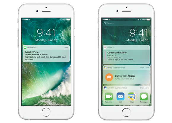
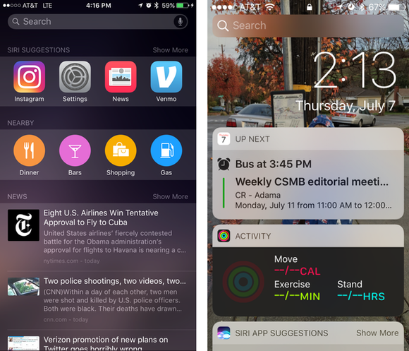
Now when you swipe right, you’ll see a completely overhauled Spotlight section with customizable widgets where Siri’s suggested apps and contacts, nearby locales, and news headlines once lived. The smarter Spotlight section we were promised in iOS 9 comes to life in iOS 10. But more on that in a second.

You’ll also notice there’s no more Camera icon on the lock screen. Instead of swiping up from that icon to jump into the Camera, your new shortcut is a swipe left on the lock screen. It’s just as easy, but again, it’s a new behavior to learn.
Swiping down on the lock screen is still the way to jump into your Notification Center, but you can access the Spotlight screen of widgets from that view, too (it’s the “Today” tab in Notification Center, just no longer labeled Today). Anywhere you go, the Spotlight screen will be there. And that’s where the widgets are.
Widgets, widgets everywhere
iOS already had widgets, but iOS 10 takes them to the next level. Apple took the same widgets from the Today tab when you swipe down to view your Notification Center and put them on the Spotlight screen. Now those widgets are accessible anywhere you are—from the lock screen, from the home screen, or from the Notification Center.
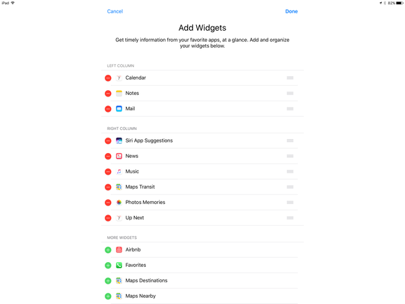
Like before, third-party apps make their own widgets, so you don’t have to install anything extra. Just tap “Edit” at the bottom of the Spotlight screen to add, remove, and rearrange widgets instead of doing that from the Today tray in the Notification Center.

Rich notifications bring the action
Apple has been working to make notifications more actionable since iOS 8, and in iOS 9, you could finally reply to a text message directly inside a notification, or mark a Reminders task as completed. With iOS 10, notifications are even more interactive.
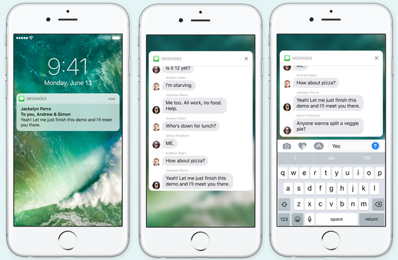
Apple is calling the redesigned notification banners that pop up on your lock screen rich notifications, because you don’t have to open an app to interact with them. Third-party developers are experimenting with rich notification interactions now, and we saw a hint of what’s to come during Apple’s Worldwide Developers Conference keynote last month with a sample Uber notification, which shows you the map of your driver’s route and allows you to call your driver or cancel the request without ever jumping into the Uber app.
Apple has already added the functionality to its built-in apps. For instance, when you receive a Calendar invite, you can view all the details and accept or decline the event directly inside the notification right on your lock screen. Messages were interactive on the lock screen starting in iOS 9, so you could quick reply to a text directly from a notification. But now you can view an entire message thread directly inside a notification banner.

Rich notifications are most powerful on 3D Touch-enabled devices—the 6s, 6s Plus, and whatever iPhone is released in September—because notifications become interactive when you deep press on them. But Apple is beta testing how rich notifications can work on older devices. Currently, you can interact with a rich notification by swiping left on it to see additional options, like Close and View, which gives you the expanded view that 3D Touch users would see by deep-pressing. To be honest, having to swipe and tap is lame compared with the 3D Touch functionality built into notifications, but I guess that’s just Apple nudging us to buy new devices.
Still in beta
iOS 10 makes your iPhone and iPad useful directly from the lock screen, no passcode required. That brings up its own set of privacy issues, though you can prevent people from seeing notifications on your locked device by toggling off Notifications View under Settings > Touch ID & Passcode > Allow access when locked. Or just head to Settings > Notifications, and tweak the settings to prevent sensitive apps from sending notifications to the lock screen at all, while still letting other notifications through.
iOS 10 is currently in beta, so Apple could further revamp the lock screen in a variety of ways. We’ll update this story with any new features as Apple pushes out more beta releases this summer.
[source :-macworld]
