Facebook constantly tweaks the content it shows in its News Feed, but today the social network has announced a different type of change coming – a redesign. It’s not going to be a radical departure from what the News Feed used to look like, mind you – just added polish here and there.
All of the following certainly applies to Facebook’s app for Android, since all of the screenshots the company shared are from that platform. The same redesign is probably headed to iOS as well, but there’s no telling whether (or when) News Feed will look this way on your desktop. On mobile, expect these changes to roll out in the coming weeks.
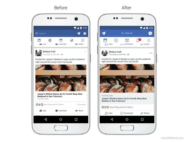
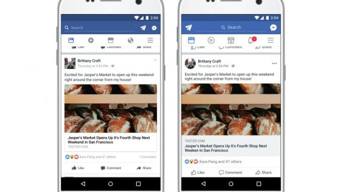
First off, the icons have been updated, alongside the Like, Comment, and Share buttons which are now larger and easier to tap. Profile pictures are round going forward, and not square, while link previews have become larger. There’s some added color contrast too, making typography more legible. Additionally, there’s a more prominent (but still redundant on Android) Back button in the top left when it’s necessary to be able to quickly return to the News Feed.
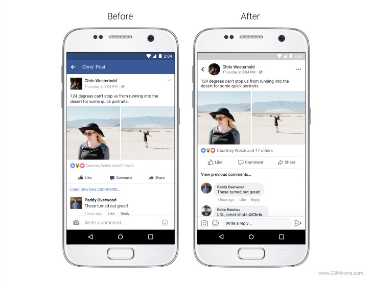
Comments are now bubbles, and these are rounded, to be aligned, design-wise, with the aforementioned round profile pictures. It’s also now easier to realize which comments are direct replies to another person (inside a thread). You can see whose post you’re commenting on, reacting to, or reading while you’re inside a post, and you’re able to see where a link will take you before tapping on it.
[Source”indianexpress”]