
Let’s cut right to the chase: The people who will enjoy the iOS 10 beta the most are iPhone 6s or 6s Plus users who don’t rely heavily on the Maps app, which is now a battery hog. If you have a device without 3D Touch, or an iPad that isn’t an iPad Pro, the benefits of iOS 10 are a little less, which makes waiting for the final release (or even, say, 10.01) all the more tempting.
Don’t get me wrong: The first developer beta of iOS 10 was relatively stable, and the first public beta is too. The biggest bugs I’ve personally encountered were annoying but not deal-breakers: Maps crashing during navigation, Maps not ending the navigation when I arrive, alarms that don’t want to turn off (quite embarrassing when it happens in an open-plan office), and a weird graphical glitch where occasionally the lockscreen-accessible camera would only take up half the screen instead of the whole thing.
I’ve been running the betas on an iPhone SE on loan from Apple, which I use as my daily carry phone. In my bag is an iPhone 6s that I bought on installments, still running iOS 9, ready for me to swap in my SIM card if I run into trouble with the SE. Hasn’t happened—aside from those bugs I mentioned and generally worse battery life, iOS 10 has been great. But while I didn’t used to think the iPhone SE’s lack of 3D Touch was a big deal, iOS 10 is showing it to be a pretty significant weakness.
Just a 3D Touch
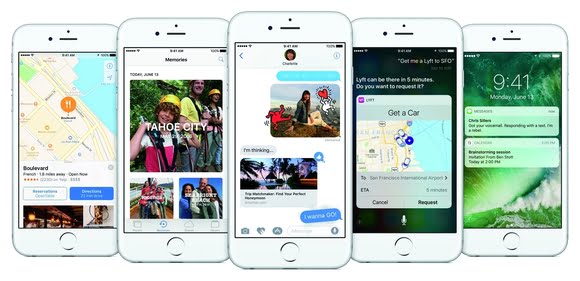
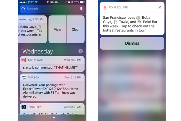
iOS 10’s biggest difference over iOS 9 is how much you can do without opening apps. Some apps will be able to integrate with Siri, so you could, say, call a car without having to launch Lyft. Notifications are getting richer, letting you 3D Touch to get more information or take action.
And the widgets that used to be confined to the Today view in Notification Center are now also on the Spotlight screen you see when swiping right from the lock screen or home screen. Widgets let you get glanceable information without opening apps, like the next hour’s forecast from Dark Sky, progress toward your activity goals, your next calendar appointment.

Widgets are just as handy no matter what phone you have. But getting them is done differently. On an iPhone 6s or 6s Plus, you can 3D Touch app icons to get Quick Actions, which are shortcuts to various places inside the app—that feature launched with iOS 9. In iOS 10, hard-pressing app icons shows any Quick Actions plus a widget for that app, if available, and you can add the widget to your Spotlight screen from there.
If you have an iPhone SE, iPhone 6, or any iPad, of course you don’t have 3D Touch. You can still see the enhanced, actionable notifications by swiping one left and tapping View, but that doesn’t feel much more convenient than just tapping the notification itself to open the app. And you can add widgets to the lineup by scrolling to the bottom of the Spotlight screen and tapping Edit for a list of available widgets, but that’s the same process as in iOS 9.
Maps looks great, but at a cost
Apple redesigned its Maps app for iOS 10. The new one is good looking and easy to use. I put it through its paces on a Midwestern vacation in which we stayed in four cities over eight nights—yeah, that’s a lot of driving. Maps handled freeways and country roads alike, and never steered me wrong or couldn’t find an address I inputted. It just crashed a lot.
When it wasn’t crashing, Maps made my iPhone SE very hot to the touch, and had a noticeable effect on battery life. Plus, sometimes I’d get to my destination, but the navigation session didn’t automatically end. I’d glance at my Apple Watch after being somewhere a while, and notice, oops, it’s still trying to direct me here, with the GPS running and draining battery life by the minute. I had to get in the habit of tapping End Route upon arrival if the navigation didn’t stop on its own.

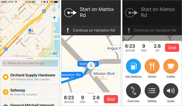
The Maps app itself is great. The maps are clear and easy to read. The interface isn’t cluttered at all. You see the arrival time as well as the minutes and miles to go, and from there you can swipe up for buttons to find gas stations, food, or coffee along the route, an Overview button that shows the whole route on a map, a Details button that shows a list of upcoming turns, and an Audio menu. One nice touch here is a new setting to pause spoken audio (like podcasts or audiobooks) during navigational prompts. Previously, the prompts would just dim the audio below them, which is fine for music but a bummer when it’s talking over a podcast and you need to scrub back to hear what was said.
So the design is solid, the data was solid in my testing, and the bugs I encountered felt typical of beta software. I’m confident Apple can surely fix them with updates. But if you rely on the Maps app frequently, you might want to hold off on iOS 10 until the ride is a little less bumpy. We’ll have a deeper dive on Maps early next week.
Bottom line
If putting a beta of iOS 10 on your everyday iPhone seems too risky, slapping it on your iPad might be a safer bet. You’ll get to play with the new Messages app, the new lock screen widgets, and the redesigned Photos, News, and Music. But iOS 10 is curiously light on iPad-specific features, especially if you don’t have an iPad Pro or at least an iPad Air 2 (which can do Split View).
Beta software is fun, but a little risky to put on devices you rely on every day. If you have an iPhone 6s or 6s Plus, and you don’t mind some app crashes here and there, think of the public beta like a training session for the new gestures and navigation shortcuts. By the time it launches to everyone else in the fall, you’ll be a 3D Touch ninja.
Even the bugs I encountered in Maps in iOS 10 while navigating the wilds of Wisconsin and Illinois didn’t hamper my experience. I’m glad I put the beta on my everyday iPhone (even without 3D Touch), and I have no desire to roll back to iOS 9. But there’s no shame in waiting, especially if you don’t want to have to be hypervigilant about backing up your devices just in case of disaster. iOS 10 will be fully ready to shake up all of our lock screens soon enough.
[source :-macworld]
