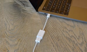

Apple’s latest laptop, the new 13in MacBook Pro, is a much anticipated re-design of the company’s notebook range and represents a brave new USB-C-only future. But is it worth sacrificing ports and spending the the best part of £2,000 to use?
The last update to the MacBook Pro that was more than simply a spec-bump was in 2012 with the addition of a high-resolution “Retina” screen. Four years on, powerful notebooks with high-resolution screens that can last all day on a single charge are commonplace in the premium market. The competition has never been more fierce.
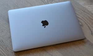
The new MacBook Pro is thinner and lighter than the old one – like almost every tech product every year. It’s also smaller in almost every meaningful way. Even the screen is thinner, and the light-up Apple logo on the lid is no more.
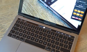
The trackpad has grown considerably, taking up a sizeable proportion of the laptop’s wrist rest In fact it’s so big you will have a tough time not touching it with the heels of your hands when you type, but thankfully Apple’s touch rejection works as advertised.

It’s also 3D Touch or Force Touch, whatever you want to call pressure-sensitive, enabled. It means it doesn’t move. I don’t miss the motion, the Taptic Engine underneath is great. The only thing I routinely use a harder click for, though, is to look up words in the dictionary, although a three-finger tap does that too.
The screen is beautiful. Vibrant, crisp, clear and bright: it’s everything you would expect from a £1,749 computer and is a big part of what makes it good to use. The 13in MacBook Pro is about as beautiful as a regular laptop can be.
Contents
Touch Bar
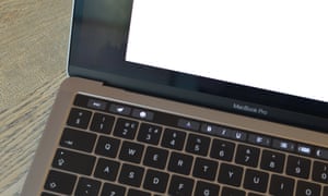
The biggest visible change is just above the keyboard. The fabled Touch Bar, which replaces the standard function key row with an OLED, touch-sensitive screen. The idea is that it gives you dynamic buttons and sliders to control various aspects of your computing workflow dependent on which app you have open.
By default and without any apps in focus, the Touch Bar displays an escape key and a row of four icons on the right with an arrow expander to show more of the traditional quick settings keys. It’s reminiscent of the Windows task bar.
Holding the Fn key will show the traditional function keys, but can also be set to expand the control keys. Alternatively they can be left expanded like a traditional control row all the time, but that limits what else can be displayed on it.

When using a particular program, it’s up to that program which functions are placed on the Touch Bar. Most provide formatting tools such as bold, italics, underline, justify and list tools. There’s the emoji button that does what you may expect in text boxes, plus there’s the same auto-complete suggestions you might get on an iPhone, although stopping typing to tap on them is most definitely slower for anyone who types at a reasonable speed.
Almost all of Apple’s apps have Touch Bar support, and most buttons and functions can be customised. I liked having the send mail button in Mac Mail on the very left, plus a trash rather than archive button. Third-party imaging program Pixelmator is a great example of what can be done with the bar: you can select various tools straight from it, then change the size of them and other aspects. With a bit of practice you can do most things with one hand on the Touch Bar and one on the trackpad.
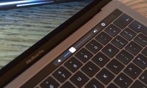
Those who use the function or control keys a lot will find the Touch Bar slows them down a bit, myself included. Those who touch type will find it more difficult to use as it’s slower to look down at the keyboard and hit a button rather than just bash out a keyboard shortcut. But for those buttons that you would normally mouse over to – in my case the send email button – having it just above the keyboard is faster and more convenient, although not as convenient as a touchscreen.
Touch ID

The power button on the end of the Touch Bar is a Touch ID fingerprint scanner. I found it a bit of a mixed bag. When it works it works just as well as it does on an iPhone 6S, though not as well as on the 7. The problem is that I found it a bit inconsistent. Not knowing when and where you can and can’t use it means its usually faster just to type a password.
Changing a setting, for instance, I normally had to enter my password, but sometimes I could use my fingerprint. When firing up the computer from cold I had to enter my password, but if resuming from standby I could use my fingerprint, unless the battery got too low, or I left it for too long, then it needs my password. You can buy apps with it, and other bits and pieces. Apple Pay works like it does on an iPad, but only in Safari.
You can also only register three fingerprints, which seems like a step backwards from the five you can register on an iPhone.
Fingerprint scanners on a smartphone were such a massive leap forward for usability, I presumed the same would be for laptops, but it wasn’t the case. I certainly don’t lock and unlock a laptop as much as a phone, so maybe my expectations were too high.
The keyboard

A lot has been said of Apple’s practically-no-travel keyboards. What you make of them will depend on your typing style. I write a lot, and I type quite lightly. I found there was enough feedback for accurate and fast touch typing, but it made a surprising amount of noise. It’s a different noise to a mechanical keyboard, but it’s definitely in that range, particularly when I was really going for it.
If you give the keys some welly when you type, if you’re used to the travel of a good mechanical keyboard for instance, then you may hate the keyboard. If you’re seriously considering buying one, get down to a shop and try it out for at least five minutes.
Specifications
- Screen: 13.3in LCD 2560×1600 (227 ppi)
- Processor: Intel Core i5 or i7 (6th generation)
- RAM: 8 or 16GB
- Storage: 256GB, 512GB or 1TB
- Operating system: macOS Sierra
- Camera: 720p FaceTime HD camera
- Connectivity: Intel Iris 550, Wi-Fiac, Bluetooth 4.2, USB-C, Thunderbolt 3, headphone
- Dimensions: 212.4 x 304.1 x 14.9mm
- Weight: 1.37Kg
General computing power
The 13in MacBook Pro has a choice of dual-core versions of Intel’s sixth-generation Core i5 or i7 processors. They’re not the latest – that would be the seventh generation – but are entirely capable. The cheapest machine (as tested) has 256GB of storage, 8GB of RAM and a 2.9GHz Core i5 processor and is not a power-house by modern standards.
It handled the work I put it through admirably – writing, processing and manipulating photos, creating small snippets of video, gifs and doing the odd bit of number crunching.
With enough tabs open in Chrome, running Evernote, Mac Mail and various other bits and pieces, I did hit the 8GB RAM cap though. As with previous Flash-based Macs, Apple’s use of a speedy page file means you might not notice until you get an occasional sluggish page load or a short delay when jumping between apps. For longevity, 16GB of RAM is worth buying for most people, given it’s soldered on and you can’t change it later.
For the general consumer, the 13in MacBook Pro is more than capable of getting the job done, but given it has “Pro” in the name, perhaps that isn’t enough. Attempting to edit small documentary-length 4K video is likely to a bit of a chore on it, particularly if you do not use Apple’s video editing suite, but then I’m not sure many who buy a 13in laptop are likely to be attempting to do so.
It’s worth noting that the massive jumps in processing performance every 12 months or so that was possible five to 10 years ago have more or less faded into distant memory, replaced instead by incremental gains and reduced power consumption in computers.
Where are all the ports?
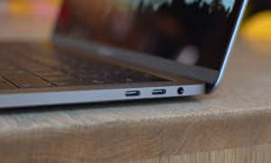
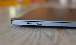
Apple has decided that USB-C and Thunderbolt 3 are the future, which means apart from a headphones/mic socket, all you get are four USB-C ports. There’s no card reader, no traditional USB, no ethernet or mini DisplayPort. USB-C is even used for power, which means any of the four ports can be used to charge the MacBook Pro.
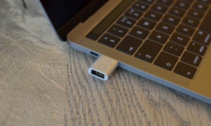
It might be the future, but right now it’s a dongle-ridden faff. How much it’s a problem depends on what you normally plug into your machine. Many things are cable agnostic – just buy a USB-C to USB-A cable to connect your printer, if you still have one.
But many are not and the lack of even just one USB-A port is irritating. I ended up carrying an extra six different cables and adapters just to continue as I was, adding another step to most peripheral action.
The funny thing is that many Android smartphones ship with USB-C to USB-C cables, meaning they can be plugged straight into the MacBook Pro no problem, but Apple’s own iPhone requires either a dongle or USB-C to Lightning cable to be bought.
Five-to-six hour battery
Lack of ports is something you can get used to. Lack of battery life is not.
Apple claims that the 13in MacBook Pro will last for 10 hours under its testing conditions. I didn’t get anywhere close to that figure. Barely using it for more than emailing and browsing with a few tabs open in Chrome, the brightness set at about 75%, Evernote and Twitter open and Double Shot preventing it from sleeping, I managed just over six hours on battery. Swapping Chrome out for Safari increased battery life for some sites, but I noticed others really chewed through battery, meaning it came out about even.
A good working day with about 10 tabs open in Chrome, as well as Typora for text, Wire for chat, Mac Mail for email, Twitter and Pixelmator open intermittently for image editing when required, I got just over five hours. I’m not sure that could be counted as really pushing the machine either.
If it was the 15in MacBook Pro I could almost imagine that you’d never use it when away from power, and that battery life wasn’t that important. But a 13in laptop is made for portability. Thankfully charging it from dead while under full working conditions only took one hour 40 minutes, and less if I wasn’t actively using it.
Observations
- I wish you could permanently place a single F key on the Touch Bar, but you can’t
- Touch ID seems slower than on an iPhone 7
- Below 5% battery the computer becomes incredibly sluggish
- Being able to plug in power either side is great
- The speakers are louder and sound better than old MacBook Pros, but still not quite room filling
- The USB-C ports are too close together to put anything wider into them meaning USB-C to USB-A adapters have to have a decent cord length to attach them next to anything else
- I kept touching the Touch Bar accidentally when resting my hands on the keyboard
- Changing the volume or brightness is now a two-stage tap and tap or tap and drag affair
Price
The 13in MacBook Pro with Touch Bar starts at £1,749 and reaches £2,759 with optional upgrades.
For comparison, Dell’s XPS 13 with a compatible screen starts at £1,129, Microsoft’s Surface Pro 4 with an Intel Core i5 starts at £849 and the Surface Bookstarts at £1,299.
Verdict
The 13in MacBook Pro could be a wonderful computer, but it isn’t. Is it great to use? Absolutely, it’s brilliant, it’s beautiful, it’s almost everything Apple said it was, I absolutely love it … until it runs out of battery. Or you have to dig out yet another dongle to use a sodding USB flash drive, or a card reader, or attach a display. Or you realise that you spent a months’ mortgage money on a computer and are having your house repossessed.
And that is the 13in MacBook Pro’s biggest flaw. It is very expensive for what it is. It hasn’t got the latest processors or graphics, it has limits on the amount of RAM you can pay to shove in it and you can’t change anything after you’ve bought it. That’s not such a problem for a general computer, but a minimum of £1,749 for a general computer, even a post-Brexit referendum Apple computer, is a lot of money.
So then it’s “for the Pros”, who justify spending large sums of money on working machines. But it’s not capable of getting through a journalist’s day on battery, let alone anyone who does anything more intensive than browse the internet, write in a basic text editor and edit the odd photo. It’ll saddle you with iPhone 7 syndrome – constantly in search of a power supply or chaining you to using it as a small desktop surrogate.
Perhaps all-day battery life shouldn’t be a thing we expect, but previous Apple computers could do just that and more.
And there’s the question of power. For almost two grand you’d expect a machine to last four to five years. For a demanding user who must have a “Pro” the RAM cap of 16GB isn’t going to cut it in two years time, which again, wouldn’t be a problem if the machine cost £1,000 not £2,000.
So, then, the 13in MacBook Pro is the best computer you shouldn’t buy.
Pros: beautiful, great screen, interesting Touch Bar, Touch ID, massive trackpad, thin and relatively light, USB-C
Cons: short battery life, no USB-A ports, no ethernet, no native display ports, no upgrading after purchase, very expensive
