So, you’ve started your own business; put all your ideas out into the world and now you’re waiting to hit it big time. But, are you seeing the results you were hoping for or has business been slower than expected? Well, if it’s the latter then perhaps you’ve missed something crucial in terms of marketing your business properly in the digital spectrum.
It’s easy to focus on the big picture when developing your business, figuring out what you want your business to offer, how you want to brand it and the audience you want to reach. But, sometimes you can get so caught up in the ‘big picture’ that you glance over minor details that could actually be extremely vital to your businesses success.
To help you stay focused on fully developing your businesses website, we’re going to layout three common mistakes small businesses fall accustom to and show you how to optimize your online strategy in order to hit your target goal:
1. Be Responsive
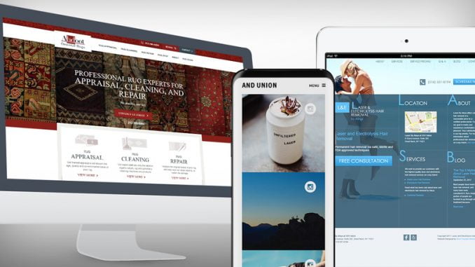
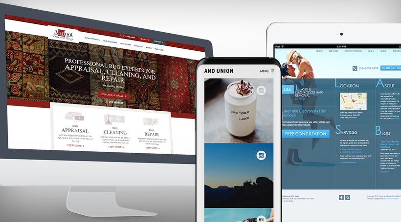
Having a website doesn’t cut it in today’s world; this is the bare minimum your business will need to survive. But you want to do more than survive, you want to thrive right? Well, you’ll need to develop a website that’s responsive – meaning that whether individuals are viewing your site from their desktop, smartphone, or tablet their experience will be an enjoyable one.
Let’s look at some facts, 94% of users cited that unattractive web designs are the main reason they’ll reject a site altogether and 48% consider it to be the number one factor of determining a business’s credibility. Additionally, 40% of users will abandon a web page that takes longer than three seconds to load and 38% will stop engaging with a site that has an unattractive layout. So, if you’re looking to bring your business to the top then you’ll have to follow the steps of some of the best website designs and develop a responsive website in order to provide a seamless UX.
Take a look at Kona Brewing Co., their website responds effortlessly regardless of the medium that is being used. There’s no need to pinch the screen or scroll horizontally, it simply morphs to fit whichever screen it appears on. This allows visitors to browse their website easily and mitigates abandonment due to design flaws.
